Menus
This is a guide, not the contract. What the platform guarantees is specified under
openspec/specs/. For this page:menus. Where this page and a specification disagree, the specification is right, and that is a defect in this page: change the behaviour there, then explain it here.
A menu is a named slot the host draws and anything may contribute to. This page adds an item to a host menu and gives a rail or bar item a menu of its own. It then opens that menu on the plain click, for an account entry with a picture. Finally it opens a menu on your own view body, places a toolbar others fill in your own content, and draws a menu inside your own sandboxed surface.
Every menu the host draws stays current while it is open. Its words change in place when a late translation bundle arrives or the language changes, and it moves with the control that opened it.
Items in a host menu
Add an item to a host menu slot with ctx.registerMenuItem (capability contributions).
It names a Command by id (invoked with the menu’s context) and may declare a coarse when
filter. The item shows only when every when key equals the same key in the opener’s context. The
host draws the menu. A right-click on a content tab opens the content/tab/context slot, in the
address-carrying pane and in any split pane of the main area alike. The context is
{ targetKind, tabId, paneId, primary, pinned, closable, sole }. paneId names the pane the tab stands
in, primary says that pane carries the address, and sole says the tab is the only one in its pane:
ctx.registerCommand({ id: 'my.tab.reveal', title: 'my.tab.reveal', run: (context) => reveal(context?.['tabId']) });ctx.registerMenuItem({ menu: 'content/tab/context', command: 'my.tab.reveal', group: '3_plugin', when: { closable: true } });An entry follows the access of the command it names. Where the session may not run the command, the
entry is not drawn, and it appears once the session qualifies. That covers a command whose access
is unmet, and in a pop-out a command that does not declare popout. A menu left without an entry
does not open. Gate the command, and every menu that offers it follows. An entry may also carry an
access of its own, which is applied first and in the mode it asks for: unmet, it hides the entry, or
with mode: 'disable' draws it inert. The command’s requirement is applied after that and only ever
hides. An entry with inline run names no command, so only its own access filters it.
The host’s own tab actions (Close, Close Others/All/to-the-Right, and a “Pinned” checkbox) live in the same
slot, and your item joins them, in every pane of the main area. The host’s entries act on the pane named
in the context. An entry of your own that belongs only to the address-carrying pane declares
when: { primary: true }. The two split entries take the tab out of its pane into a new one. They are
offered only while other tabs share the pane, through when: { sole: false }. The pane toolbar’s split
duplicates the open item instead, and is the way to split a lone tab. Use the same condition on an entry of
your own that would leave the pane empty. Command behaviour crosses the sandbox boundary because it is referenced by
id (the context is plain, serialisable data); an inline run on a menu item is trusted, in-process only.
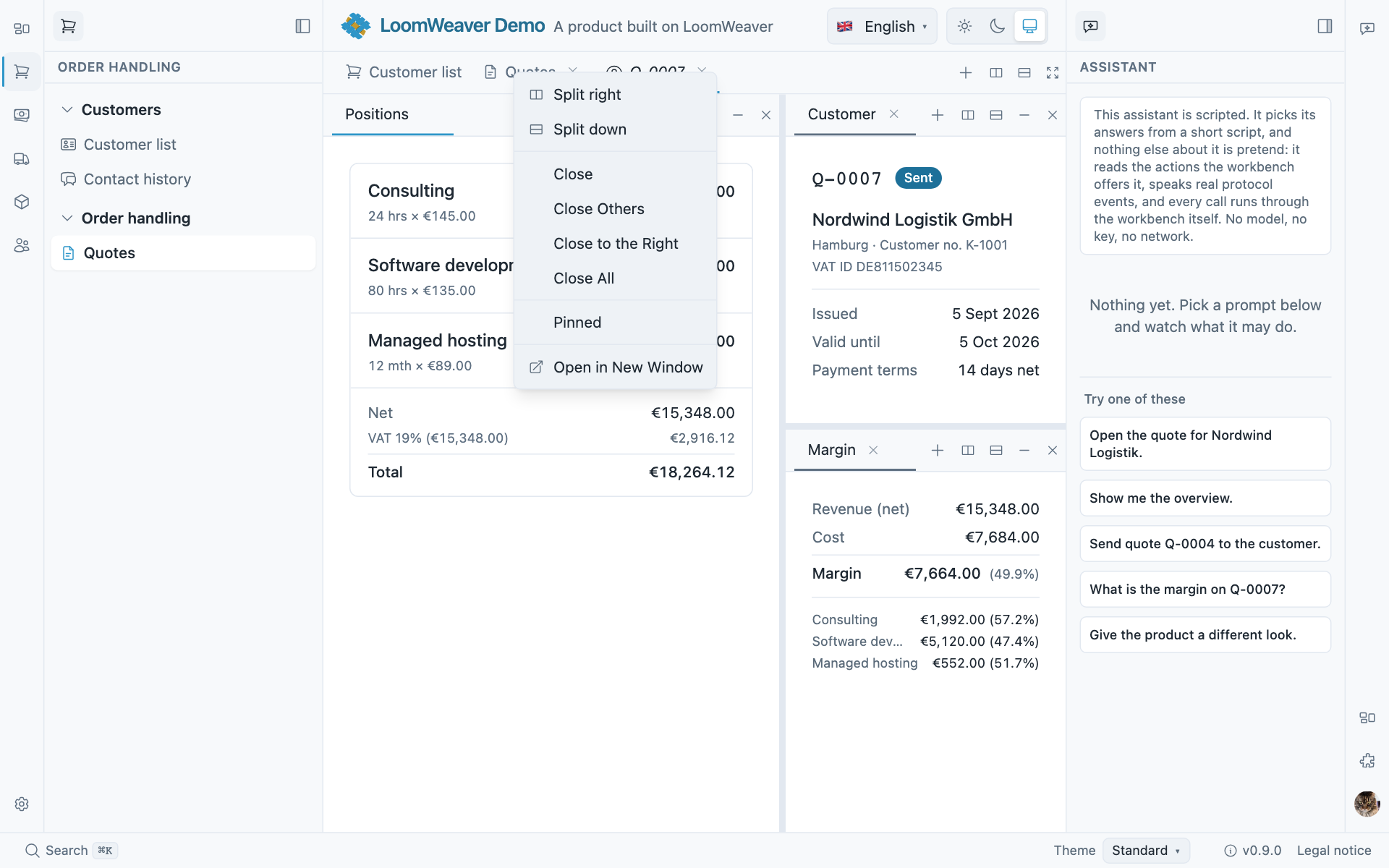
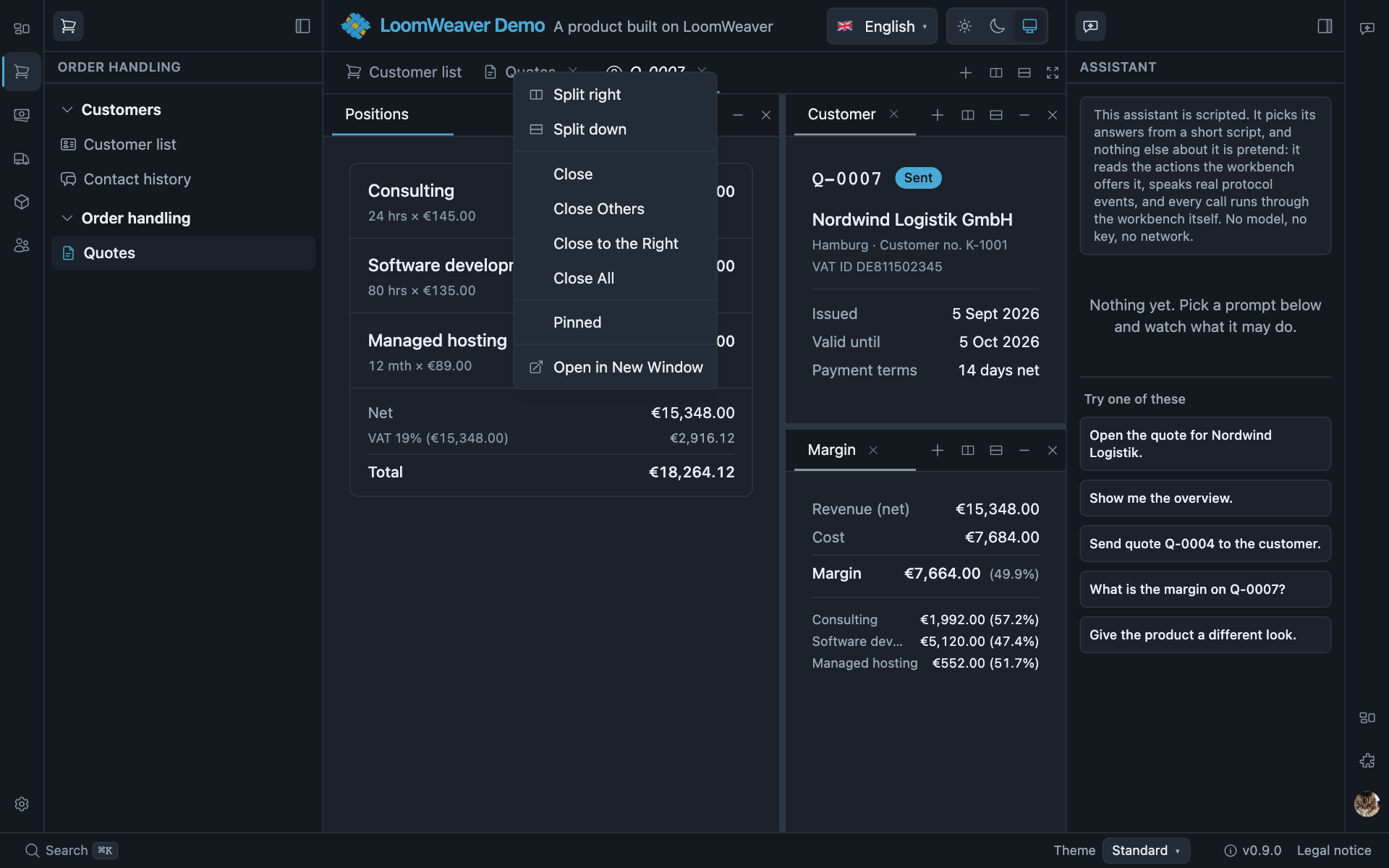
The host’s menu on a content tab. Your item joins this slot beside the host’s own actions.
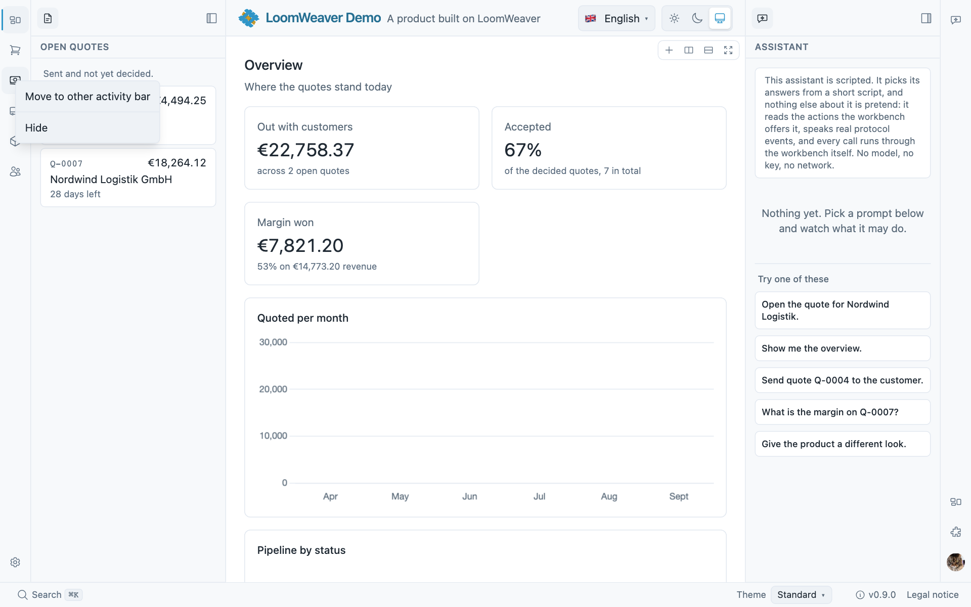
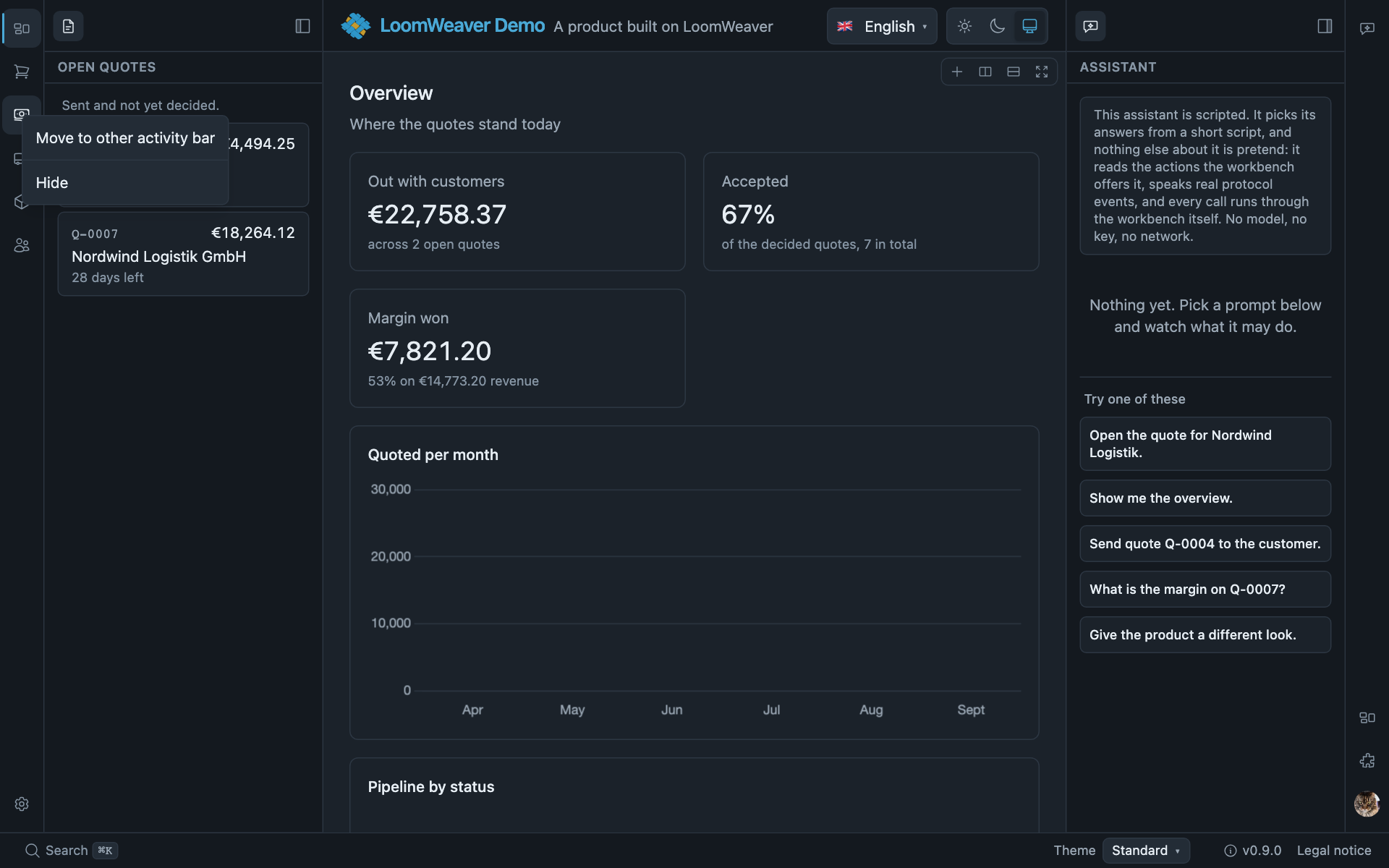
The host’s menu on a rail entry, and the same slot for an entry that declares a menu of its own: the host’s Hide is added to it rather than replacing it.
A menu item may carry its own optional id: re-registering that id replaces the entry (last-in wins),
the same rule as every other contribution. The built-in entries use menu:<commandId> ids
(e.g. menu:shell.tab.closeAll), so a distribution can hide or swap a standard entry.
Building a distribution shows how. Without an id your item is
purely additive.
A menu item shows its referenced command’s icon and keyboard-shortcut hint automatically; an
icon or title on the item replaces the command’s. Add
checkedWhen to make it a checkbox (role="menuitemcheckbox"): it is checked when checkedWhen is a
subset of the opener’s context, so one toggle item replaces a Pin/Unpin pair (the command reads the state
from the context and flips it). A checkbox item keeps its command’s icon: the check has a leading place
of its own and the icon follows it, so a menu of modes that each have a symbol can still mark the one in
effect. A menu without any checkbox reserves no space for the check, and one without icons none for those.
Where no item has both a check and an icon, the check takes the place the icons stand in, so the names
start after one leading place rather than two.
ctx.registerCommand({ id: 'my.tab.togglePin', title: 'my.tab.pinned', // `context` is optional and its values are `string | number | boolean` — narrow before use. run: (c) => { const tabId = String(c?.['tabId'] ?? ''); if (!tabId) return; if (c?.['pinned']) unpin(tabId); else pin(tabId); },});ctx.registerMenuItem({ menu: 'content/tab/context', command: 'my.tab.togglePin', when: { closable: true }, checkedWhen: { pinned: true } });Item-attached menus (any region)
A context menu is not tied to the tab strip: a RailItem,
BarButtonItem or ViewAction can carry a menu?: string slot, and the host opens it on right-click with a
{ targetKind, id, region } context. Contribute items to that slot the same way; e.g. the
built-in view-tab menu offers “Move to other sidebar”. One mechanism, every region.
A view’s tab opens panel/view/context with { targetKind: 'view-tab', viewId, region, inContent, sole }
wherever the tab stands, in a sidebar or in a pane of the main area. inContent says the tab stands in
the main area. The built-in “Open in content” and “Move to other sidebar” carry when: { inContent: false },
because neither has anywhere to go from there. “Stack below”, “Reset view”, “Open in new window” and “Hide”
are offered everywhere. An entry of your own that takes the view somewhere can use the same condition.
A menu on the plain click
A RailItem, a BarButtonItem or a surface’s action may add
menuTrigger?: MenuTrigger to say which gesture opens its slot: 'context' (the default, the
right-click above), 'primary' or 'both'. With 'primary' or 'both' the menu opens when the
item is activated, by click, Enter or Space alike, anchored beside the control the host drew and
flipped to its other side rather than covering it. That is the account entry a workbench with a
signed-in user needs:
ctx.registerRailItem({ id: 'notes.account', rail: 'primary', anchor: 'bottom', icon: 'user', initials: 'AR', title: 'notes.account.title', menu: 'notes.account/menu', menuTrigger: 'primary',});ctx.registerMenuItem({ menu: 'notes.account/menu', command: 'notes.signOut', group: '9_session' });The workbench ships no person glyph, so user here is an icon the plugin contributes itself with
ctx.contributeIcons, as Icons and theme shows.
Add menuHeader: { title, detail?, icon?, initials? } and the host draws a heading above the first
entry, which is where the name belongs when the control itself is a two-letter badge:
ctx.registerRailItem({ id: 'notes.account', rail: 'primary', anchor: 'bottom', icon: 'user', initials: 'AR', title: 'notes.account.title', menu: 'notes.account/menu', menuTrigger: 'primary', menuHeader: { title: displayName, detail: emailAddress, initials: 'AR' },});Without a command the heading is not an entry: nothing activates it, and the arrow keys pass over it the way they pass over a separator. The menu is announced by what it names, so the name reaches the user once rather than twice. A menu opened at the pointer carries none, because what it acts on is under the pointer.
Give the heading a command and it leads to what it names, the way a click on the person in an
account menu opens their profile:
menuHeader: { title: displayName, detail: emailAddress, initials: 'AR', command: 'notes.profile' },The heading is then the menu’s first entry. The down arrow reaches it first, a click, Enter or Space runs the command with the menu’s context and closes the menu, and it looks like an entry under the pointer. A screen reader hears the name once on the menu. The heading is named by what it shows, followed by the command’s title, such as “AR, Ada Rossi, ada@example.com, Profile”. A person who speaks what they see reaches it that way too. You need no separate “Profile” entry below it. A command that nothing registers leaves the heading a plain heading.
Activation offers your slot alone: the workbench’s own entries for that item, the ones that hide
it or move it to the other rail, stay on the right-click, where a curation entry beside “Sign out”
would be noise. Such an item needs no command or run. The host draws it without one for as long
as its menu offers an entry; see a slot that others fill. Where it names
one anyway, the item is always drawn: it runs that action while its menu is empty and opens the menu
once the menu has an entry. On an item
carrying workspace: the click is the switch, so its menu keeps the right-click. The host owns the
rest: it announces the control as opening a menu, tracks whether it is open, and returns focus to it
when the menu is dismissed.
A slot that others fill
A control whose activation opens a menu is drawn only while that menu offers at least one entry to the person looking at it. It appears when an entry is contributed and goes when the last one is withdrawn. That lets one plugin own a slot and others fill it, without either reading the other:
// the plugin that owns the listing offers the placectx.registerSurface({ id: 'kb.entries', title: 'kb.entries.title', component: EntriesView,  routable: { path: 'entries' },  actions: [    { id: 'kb.entries.add', icon: 'add', title: 'kb.entries.add',      menu: 'kb.entries/sources', menuTrigger: 'primary' },  ] });
// any other plugin fills itctx.registerMenuItem({ menu: 'kb.entries/sources', command: 'scanner.importIntoKnowledgeBase' });
With no source installed there is no button, so nobody clicks into nothing. You need no call that reads the slot, and no convention on command ids.
Where the control has something to do without the others, give it a command of its own as well.
It is then always drawn. While the slot is empty, activating it runs the command, as a plain button.
Once the slot has an entry, activating it opens the menu instead. A heading does not count as an
entry here, so name the same command in menuHeader and it leads the menu:
actions: [ { id: 'kb.entries.add', icon: 'add', title: 'kb.entries.add', command: 'kb.entries.upload', // alone: one click uploads menu: 'kb.entries/sources', menuTrigger: 'primary', // in company: the menu opens menuHeader: { title: 'kb.entries.upload', command: 'kb.entries.upload' } },]A menu that is only on the right-click changes nothing about its control: that control has a purpose of its own and stays.
A slot exists because something declares it: a menu the workbench draws, or a rail item, bar button or
surface action that names it as its menu. A menu entry that names it as its submenu declares it
too, as do a toolbar a plugin registers and a registered surface, which declares its own
<surface id>/actions. An entry aimed at a
slot nothing declares is kept, so it appears the moment the slot is declared, and is reported to the
developer once the composed plugins have finished activating: in the browser console, and in
loomweaver.report(). It is not reported
at registration time, because the plugin that fills a slot may well activate before the plugin that
owns it. The usual cause is a typo in the slot id, or an owner the distribution did not compose.
A toolbar in your own content
A menu slot can also be drawn open, side by side, wherever you place it in your own content: a
toolbar. Register it once, under a slot of your own, and place <lw-toolbar> as often as you like,
each placement with a context describing what it stands beside. Anything fills it with the same
registerMenuItem that fills a menu, and the same rules apply. when is matched against the
placement’s context, and groups are drawn with a separator. The label, icon and shortcut come from
the command. An entry is dropped where its command is unregistered or the session may not run it.
// the plugin that owns the records registers the toolbar, onceexport const RECORDS_TOOLBAR = 'acme.records/toolbar';ctx.registerToolbar({ slot: RECORDS_TOOLBAR, title: 'acme.records.toolbar' });ctx.registerMenuItem({ menu: RECORDS_TOOLBAR, command: 'acme.records.open', group: '0_own' });<!-- …and places it once per row, with the row as the context -->@for (record of records(); track record.id) { <li> {{ record.title }} <lw-toolbar [attr.menu]="toolbar" [context]="{ record: record.id, kind: record.kind }" size="sm"> <span order="100">{{ record.updated | date }}</span> </lw-toolbar> </li>}// any other plugin fills it, for notes only, and offers a nested menu of its ownctx.registerMenuItem({ menu: RECORDS_TOOLBAR, command: 'scanner.star', when: { kind: 'note' } });ctx.registerMenuItem({ menu: RECORDS_TOOLBAR, title: 'scanner.sources', icon: 'more', submenu: 'acme.records/sources', menuHeader: { title: 'scanner.sources' } });ctx.registerMenuItem({ menu: 'acme.records/sources', command: 'scanner.import' });The command runs with the placement’s context, so scanner.star reads context['record']. An
entry with a submenu opens that slot beside itself on activation and is drawn only while the slot
offers something; with a command as well it runs that while the slot is empty. The same entry in a
menu rather than a toolbar opens the slot as a submenu, by the same rule, as the next section shows. A toolbar whose
slot offers nothing to the person looking at it takes no space, and appears when an entry arrives.
Where the row is too narrow for every entry, the toolbar folds from the end into a control that
offers the rest. It is one tab stop; the arrow keys walk its entries. The toolbar is announced by
the title you registered, or by a label attribute on the placement where one placement differs.
Your own controls go inside the element as children, with an order attribute where the position
among the entries matters, as the date above does. Another plugin that runs in the page puts a
component of its own in with registerToolbarCell({ id, slot, component, order }); the component
injects TOOLBAR_CONTEXT to learn the slot and the placement. A cell is not read by the workbench:
no command, no when, no shortcut, and it folds whole. It also never reaches a toolbar drawn inside
an isolated surface, because code does not cross that boundary; there, the declarative entries do.
An entry looks like every other entry unless it names a variant, from the vocabulary
<lw-button> has: primary, default, success, danger, warning, info, ghost. In a
toolbar it is then drawn as that button is, at the toolbar’s size; in a menu the variant is ignored.
An entry without one keeps the toolbar’s own faint look, which is not default: default is the
bordered button. A primary entry always shows its title, with its icon before it, and an entry
that shows its title and opens a slot carries a chevron, so “New” can be one button that opens what
other plugins contribute:
// the owner's main action: one primary button that opens the ways of adding, its own and others'ctx.registerMenuItem({ menu: RECORDS_TOOLBAR, title: 'acme.records.new', icon: 'add',  variant: 'primary', submenu: 'acme.records/new', group: '0_own' });ctx.registerMenuItem({ menu: 'acme.records/new', command: 'acme.records.write' });
// another plugin's destructive entry reads as dangerousctx.registerMenuItem({ menu: RECORDS_TOOLBAR, command: 'scanner.purge', variant: 'danger' });
primary belongs to the slot’s owner: the plugin that registered the toolbar, or for a surface’s
actions the plugin that owns the surface. Asked for by any other plugin, the entry is drawn without
a variant and the developer is told once, so contributions cannot compete for the main action.
Every other variant is open to every contributor. A name outside the vocabulary is dropped and
reported the same way.
The slot is yours: export its id so the plugins meant to fill it can name it. A second plugin registering a toolbar under the same slot is refused and reported. The slot a toolbar registers, like the slot a control names, is what declares it for the undeclared-slot report above.
A surface’s own actions are such a toolbar too, on the slot <surface id>/actions. The actions
you declare on the surface are its owner’s entries. Any plugin may add to a surface’s header with
registerMenuItem({ menu: 'acme.records/actions', … }), as it adds to a menu.
A picture where you have one
A rail item, a bar button and a menu heading all take
image, anything an <img> accepts, drawn round in place of the icon and the initials:
ctx.registerRailItem({ id: 'notes.account', rail: 'primary', anchor: 'bottom', icon: 'user', initials: 'AR', image: person.avatarUrl, title: 'notes.account.title', menu: 'notes.account/menu', menuTrigger: 'primary', menuHeader: { title: person.name, detail: person.email, initials: 'AR', image: person.avatarUrl },});The ladder is picture, then initials, then icon, and the host falls back: a picture that is missing or that fails to load leaves the control looking exactly as it would without one. So you do not have to handle the ordinary case of a person having no photograph. Re-register the item with the same id when the picture arrives and the rail redraws.
The same two fields sit on a bar button, so the account can live in a bar rather than in the rail. The host derives which way its menu opens from the bar’s own edge: downwards from a top bar, upwards from a status bar, sideways from a bar docked left or right.
The workbench does not fetch anything for you: the address is yours, and a picture served from another origin has to be allowed by your own content policy. The picture is decoration, so the entry stays announced by its title and the menu by its heading, rather than naming the person twice.
The browser’s own menu stays where nobody draws one
Only the element that opens a menu suppresses the native context menu. Everywhere else, your view body and above all a text field inside it, a right-click still gives the user cut, copy, paste and spellcheck. Draw your own only where you mean to replace it.
A submenu
Any entry of a menu can open a submenu that unfolds beside it. The entry shows a chevron, and the submenu opens when the pointer rests on the entry, on a click or tap, or from the keyboard with the right arrow, Enter or Space. The left arrow and Escape close the submenu alone and put focus back on its entry, Tab closes the whole menu, and choosing an entry inside closes every level. The submenu lines up with its entry and opens on the other side where the window has no room. Its entries show icons, shortcuts and states like any other entry.
In a slot, give the entry a submenu and contribute to that slot like to any other. It is drawn
while the slot offers something; with a command as well, it runs that command while the slot is
empty. A slot that leads back to one already open above it is not offered again.
ctx.registerMenuItem({ menu: 'content/tab/context', title: 'notes.menu.share', icon: 'popout', submenu: 'acme.notes/share' });ctx.registerMenuItem({ menu: 'acme.notes/share', command: 'notes.copyLink' });ctx.registerMenuItem({ menu: 'acme.notes/share', command: 'notes.exportPdf' });A menu on your own view body
A right-click on your own in-process view body (a list row, a canvas node) is not a host slot;
nothing else contributes to it. Call ctx.ui.openMenu(items, { x, y }) (capability ui) with
ad-hoc items, each with a label, an optional host icon name and an in-process run handler. The
label is a key of your own bundle or a literal, like every other piece of chrome text. Every label
is looked up as a key, and the open menu is re-worded when the strings of the language in effect
arrive, including after a change of language.
A label no bundle knows, such as a name the user typed, is shown as it is. Development reports one
that looks like a key, with a dot and no spaces, as a missing key, and a literal that happens to equal
a key a bundle knows shows that key’s text. The host draws the items as its own <lw-menu> at the
cursor, with the same positioning, Escape and outside-click dismissal and focus return as its menus.
The menu is body-level, so a virtual-scroll or transformed ancestor never clips it.
// inside the component; `ctx.ui` reaches it through the same bridge as any other ctx pieceonRowContextMenu(event: MouseEvent, note: Note) { event.preventDefault(); ctx.ui.openMenu( [ { label: 'notes.menu.open', icon: 'document', run: () => this.open(note) }, { label: 'notes.menu.move', icon: 'sort', items: [ { label: 'notes.menu.up', shortcut: 'alt+ArrowUp', run: () => this.move(note, -1) }, { label: 'notes.menu.down', shortcut: 'alt+ArrowDown', run: () => this.move(note, 1) }, ] }, { label: 'notes.menu.delete', icon: 'trash', run: () => store.remove(note.id) }, ], { x: event.clientX, y: event.clientY }, );}An item with items instead of run opens them as a submenu. An item may name a shortcut, a
chord in the vocabulary of a command’s shortcut; the menu shows it the way the platform writes keys,
arrows as arrows, and does not announce it. A named key takes the macOS symbol where there is one and
otherwise a word in the interface language: 'mod+delete' reads ⌘⌦ on a Mac and Strg+Entf in a
German interface elsewhere. An open menu follows a change of language. Name the key your handler
listens to: 'delete' is forward delete, 'backspace' is the key macOS labels ⌫, and 'del' is the
platform’s delete key, ⌫ on a Mac and Delete elsewhere. It is a hint only:
the workbench binds nothing, so your view handles those keys itself.
It is trusted rung only: run is a function, so it does not cross the sandbox boundary. A
sandboxed surface draws its own menu instead, below.
Your own surface menu (sandbox)
Inside your own sandboxed iframe surface you draw the menu yourself. Load the
frame UI kit (/frame-kit/lw-elements.global.js defines <lw-menu>
along with the rest of the family), build <lw-menu> + <lw-menu-item> on right-click, and call
menu.openAt(event.clientX, event.clientY). A <lw-menu> you put inside a <lw-menu-item> is that
entry’s submenu, with the same pointer and keyboard behaviour as the host’s, and a choice inside it
reaches the outer menu’s lw-menu-select. Such an entry is presented the way the WAI-ARIA
authoring practices present a submenu: the <lw-menu-item> takes no role, and a row inside it is the
menu item that takes the focus. A test that finds entries by role and name finds it as before. Handle the selection in-process: no cross-frame
coordinates, no RPC. The paint follows the host tokens pushed to the surface, so it matches the app theme.
Where next
- Commands and their triggers: the command a menu entry names, and its rail and bar triggers.
- Host UI and host facts: the rest of
ctx.ui, dialogs, toasts and progress. - Sandboxed surfaces: the kit that gives a sandboxed surface
<lw-menu>.